
For the search on Art in Pinterest I realized quickly that there were works of a female. Most of them were self portraits but I stopped at the image of a ballerina. I stopped because it was graceful and the graffiti used to create the tutu contrasts her grace. I stopped because the image is a stereotypical portrayal of a ballerina. The artist is saying this is a ballerina in all her beauty but things may not be as beautiful as they appear. There is chaos present in the calm demeanor of the dancer. The rest of the images portray typical characteristics of a female, soft and thin faces with luscious lips. All these images emphasize the self-image that Berger was talking about.
Category Archives: Uncategorized
Menu
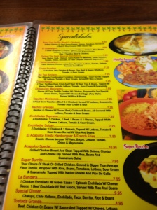
El Acapulco Menu
Here is the aforementioned menu. I think I made a bigger deal about it than I actually should have. I apologize for the picture I thought it was a better quality. After a recent visit to the restaurant I realized that the menu is not that bad. The food is split up into different categories that include Chicken heavy dishes, Beef and Steak heavy dishes and the one included in the picture Specialty foods. There are just a few suggestions that I would have for the owner in regards to making the menu visually pleasing. I understand that the color scheme matches with the theme of the restaurant but the yellow seems like its a bit much, a white background would help in letting the text stick out. The food is separated into categories but they are still very close to each other. I think that adding more space in between the food would help get rid of the cluttery feeling that the menu gives off. They do a great job in translating the traditional titles of the Mexican dishes into English. It really helps when I know what the foods are so that I can better explain to non Mexicans what the dishes consist of.
Head in the McClouds
Now that we have finished McCloud’s book I see the artistry in comic books. I never demeaned them before I took this class but I didn’t hold the artists behind the images in a high regard. There is so much that we as readers do when we read that we don’t realize how our mind works. The idea behind closure is awesome. I do that without even realizing that I’m doing it. But now that I am conscious of it I’ve realized that I do that when reading a novel. When an author gives us a part of the whole we need to complete it to make it real.
Another point that surprised me is the battle between the abstract and realistic. I never realized that through abstraction I related much more to the image. That abstraction allows me to put myself in the shoes of the image. I’ve had my head in the clouds for too long
Death by Powerpoint
Before enrolling in English 429 I had the priviledge of taking Rhetoric. In that class I learned how to speak to an audience. I learned that appearance, posture, placement of hands, eye contact, projection of the speakers voice and practice, practice, practice are key to a successful presentation, or speech. My professor stressed the importance of not reading off the powerpoint but never delved into the visual aspect of the powerpoint. The importance of the visuals in the Powerpoint slides is an aspect of presentation that I have picked up on since it became a popular medium for presentations. If the visuals are to dull they will loose the viewers attention but if they are to flashy it hurts the viewer’s eyes and it makes them loose interest in all that is going on. The presenter has to find a middle point between the two and to do so I believe that the viewer has to be fully aware of who they are presenting to. A viewer does not have to know the proper vocabulary for visual rhetoric to see that they don’t like something. Keep it simple stupid. There are so many different aspects that go into making a great presentation and we have to be conscious of that. Death by Powerpoint is a horrible way to die. But here I am, I have come back from the dead to warn you of what can happen if you don’t do the right thing. Please do not let others suffer my same fate, death by Boredom!
Graphic Novel

Incognegro cover
For my graphic novel project I have chosen this. Incognegro, written by Matt Johnson with art by Warren Pleece. The entire novel is in black and white which I think is a great choice. The novel is set in America during the 1930’s so the black and white adds to the setting. It is about a mixed man that can pass as a white man because he has fairer skin. I have only looked up the plot synopsis because I want to read it to actually take it all in. I love the style of the art and the clothes that everyone in the novel wears. I’m looking forward to keeping you guys up to date and delving into this genre of graphic novels.
Collage
For my document design project I decided to make a flyer for an upcoming studio with the art club. I want the viewer’s attention and if it isn’t obvious enough the piece itself is a collage. My message is simple and clear, I want all that are interested in this medium to join us. I believe that the typography I used works at getting the attention of the viewer. Culturally this kind of text is used for ransom notes, and that’s what I want. I am giving the viewer a message, join us. In collage, patches of colors and shapes are used to create the same thing as working with oil or acrylic paints. I did that in the background but in the foreground I chose to mix and match the text. I want the viewer to look at this flyer and change their perspective. The background emphasizes this change of perception. Up close one can recognize that camouflage is splotches (or in modern camouflage, geometric shapes) of color. But the purpose of camouflage is so one cannot be recognized in an area with colors similar to the camouflage, so that one blends in. Like collage, camouflage is a mix of colors to change how a viewer perceives color. I would want this flyer to be everywhere the others are placed. I would also want them placed in unorthodox places like maybe the bathroom or something.
I made the conscious decision to create a physical flyer. I am creating this flyer for the art club. Fine art is created by an artist that is able to work with his medium by hand, like sculpture, and painting. I was going to use color paper to create the camouflage but I chose to use colored pencils. It took me a while before I decided to make the background camouflage. I was going to leave it blank but then the only thing collage about the piece are the words. I also chose to make this a tangible piece because I didn’t feel comfortable enough using a computer program. While creating my piece I realized that camouflage was a great choice. Now, I don’t know much about high end fashion but I am comfortable with street or “urban” style. In street style camouflage is used because they can wear whatever they want with it regardless of color. The text that I have used comes in all shapes and colors. Creating this I also realized how negative shapes create a lot of those splotches of color. There is no solid background color but if I had to choose I would say that it is the background color. It was great peer reviewing this piece because both of those that reviewed me automatically realized that my piece is a collage itself. If I had it my way I would individually create each flyer to emphasize creativity and individuality. The camouflage and the text would remain but it would be different for every flyer.
I ended up going with the collage studio opposed to the ceramic studio because I felt that creating a flyer for collage would be better for this project. If I had gone with ceramics there would be a need to show pictures of the three dimensional pieces. I couldn’t find a way to make a flyer of ceramics original. Why not make the flyer a work of “art”? This way I am able to show the viewer the medium as well as invite those that are conscious enough to see that I have used collage to create this flyer.
For this project I used the art club and other classmates for help. I approached them with this idea and asked them to help me with it. Even though this is a project for my class it is as much for them as it is for me. I bounced ideas off of them and asked them for their opinion on everything. They helped me decide to make the text a mix of magazine print. I was going to print off the text and then glue or tape it onto the piece. The material’s I used were color pencils, paper, magazines, scissors and glue. I also needed the library’s vast collection of magazines to help me get the text. The background was inspired by a piece of art that a former love made for me, so I guess she should be given credit as well.

Collage Studio Flyer
North Carolina’s very Own.
J. Cole is a rapper from Fayetteville, North Carolina and he is one of the best rappers in the game right now. Like most of the music I have been listening to lately I cannot stop listening to it. The lyrics are on point. There is a contradiction going on here. He talks about hating rich people but he is rich now. Throughout his life he was broke but now that he has money, his kids are the ones that are going the be the rich kids. Is he becoming the thing that he used to hate?
The album art is a juxtaposition. It is a horned figure that one will assume is a demon but there is a crown that the figure is looking at. Everyone has to fight off the demons. We are human. Have you ever had to make those decisions? When you decide to be selfish and choose what you want instead of what is morally right? I have.
J. Cole. Rich Niggaz. Roc Nation. Web. 2013
Text
After working with how important text and color are to design I have decided to relate it to another fine artist. This time I have chosen Jean-Michel Basquiat, remember him? He is a fine artist but one look at his work and one questions whether it is a child that has created this work. He consciously made the decision to create work like this and like Picasso, he made the audience question what exactly fine art is.
The first is a work of Basquiat titled Charles the First. At a single glance the viewer realizes that this is a flat surface and there is really no attempt to create a three dimensional surface. The viewer sees a mix of words and illustrations in three seperate sections created by vertical lines. Some of these words are not very visible and one word is even crossed out. The crossing out of this word grabs the attention of the viewer. Because it is crossed the viewer questions why and I believe that he made the choice to cross out that word for a reason. Because we are in America we read the work from left to right looking for some sort of message because that is what makes a piece “fine art” right?
The second piece is a work of Basquait titled Sugar Ray Robinson. I chose this piece because this work is comprised of text, color, and illustration. The text and illustrations are prevelant because of the contrast with the dark background. Sugar Ray Robinson was a welterweight and middleweight boxer of the 1940’s and 50’s. He was a black boxer in a period of American history where blacks were discriminated against. I think Basquiat captures that era perfectly in this piece. The head of what one will assume is supposed to be Robinson with a crown floating above his head are surrounded by darkness. The viewer cannot even see his body only his head. Basquait has crowned Robinson as a black king in a time when blacks could not even use the same water fountains as whites. The only colors used in the piece is black and white, but the darkness consumes the white.
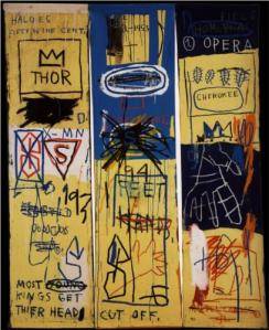
Charles the First

Sugar Ray Robinson
Neo-Soul
I’ve had this song on replay since I discovered it. I cannot get away from the groove and Erykah Badu’s unique voice. It is sweet but it has a rasp that adds a roughness to her sound. It is produced by one of my favorite Rap producers J. Dilla I think that’s also why I love it. The beat is smooth and soulful, all that is needed for me to fall in love with a song. They lyrics are simple but clear and universal. We all have to make decisions, sometimes we make the right ones sometimes we don’t. That is what makes us human right? Whether they are the right or regretful decisions, we have to keep moving forward.
Erykah Baduh. Didn’t Cha Know. Motown. Web. 2001.
Typography: Its Everywhere!
Below are a few examples of Typography in things we see everyday.
The first is an example of a poster from 2003. The typography is not Helvetica. Modest Mouse is an Indie band from Issaquah, Washington. I really like what the artist did with the entire poster and the typography. Its unorthodox and it works with what is going on in the poster. The important information is in bold letters. The big blue head is the center of attention but the psychedelic waves emiting from the head lead you to the venue and the name of the band
The second is my journal that i purchased in 2010. The typography is copying a comic book. Its bubly and some of it in bold to emphasize the reactions of this dynamic duo. While the words are everywhere we are taught to read from left to right. This type of typography is something that one is accustomed to find in a comic book.
The final picture is a typograhpy from an old book that I found in the library. The text is all fancy to emphasize the times of the author. Robert Burns is a Scottish poet of the 18th century. The text reflects the times because of all the ornaments that surround the text and the fanciness of the words themselves. Unfortunatly I did not read the book I only looked at this page. I am pretty sure that the rest of the book is not in this text. The opening page is like this to grab the attention of the reader.
I do not have any pictures of the last example that I want to use. I looked at three of the novels that I have in my room to see if there was a difference in the text. To my surprise there was not. I believe that the text is Times New Roman but do not quote me on that. All of the novels were published in the 21st century so I am sure that was a major influence in the way that the text was portrayed. Since watching that documentary in class I will never look at words the same
Image Credit: Dennis Zaragoza

Modest Mouse Poster

My Journal

Crazy Old Book (found in Gardner-Webb Library)
